What Great Architectural Design Looks Like in Greater Cleveland
In the realm of home remodeling, the true mark of excellence is the ability to blend the old with the new, create stylish opportunities for the inclusion of natural light, design seamless additions, and other practices that exhibit architectural expertise. In the Greater Cleveland area, there is no shortage of good architecture, but what makes it great?
How to Spot Great Architectural Design in the Greater Cleveland Area?
There are a few tell-tale signs of excellent architectural prowess. When you know what to look for, you'll be better prepared to spot the difference between okay design work and exceptional design work by home remodelers in Cleveland.
Respecting History
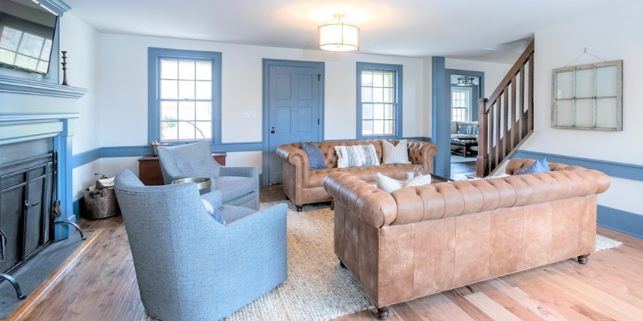
Adding onto and remodeling a historic home takes great knowledge and skill. Not only does a home remodeler need to respect and retain the historic architectural elements of the home, but the addition and new materials need to correspond to the original home as well. Whether a remodeler is restoring the home’s materials or replacing historical elements with replicas, both take great experience, attention to detail, and impeccable craft.
A fantastic example of this skill and attention to detail is the Century Farmhouse project in Chesterland, Ohio. The owners wanted to create additional space in their farmhouse while staying true to the style and original architecture of the home. The original staircase and windows were restored to their former glory and are accentuated by the classic blue on the trim throughout.
Custom Built-ins
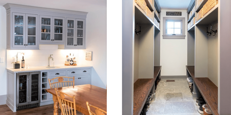
The “measure twice, cut once” mantra is especially true for custom built-ins. The perfect fit and proportions necessary for a custom shelf, cubby, wet bar, closet, and entertainment center take a keen eye. Whether the home is 10 years old or 100 years old, the design should also correspond to the overall aesthetics of the home. Trim, hardware, and style should not be overlooked, even with what many would see as a straightforward application.
Once again, we’re brought to the Century Farmhouse, where every opportunity for extra storage is explored. The mudroom is outfitted with all custom locker cubbies, seating in a complementary natural wood tone, and shelving. In an older home, where storage is often lacking, this type of addition is a necessity but also offers style–the epitome of form and function.
Also in the Century Farmhouse is a wet bar in the dining area that offers more storage in a sophisticated fashion. Glass-front cabinets above offer an airiness that could be otherwise snuffed out with solid cabinet doors. With a place for every tool, glass, and bottle, every inch of this corner of the dining area is utilized, corresponds to its surroundings, and is perfectly balanced. Even the beverage cooler below mimics the style of the cabinet doors above.
Mixing Design Eras
Not every homeowner feels compelled to commit to one era of design. Mixing design eras takes a deep knowledge of each to know exactly how they can play off one another to create a cohesive look. As they say, “You must know the rules first in order to break them.”
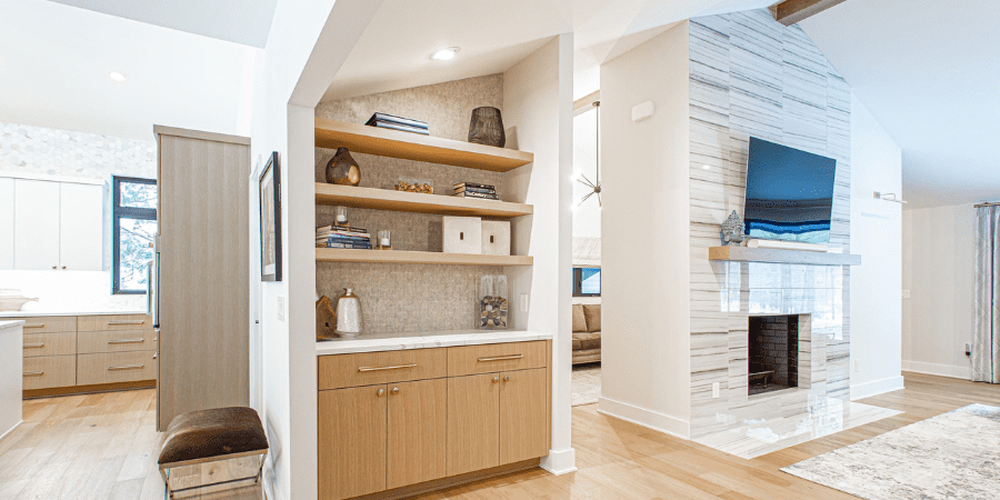
This 1961 ranch whole-home renovation and addition in the Greater Cleveland area retains the original lines of the era, but with updated finishes to blend the original structure and current trends. Mid-century modern design is known for its streamlined and elongated look. The main goal for this whole home remodel was to keep the original style of the home while updating the finishes to feel current and fresh. Blending contemporary finishes and details suited this mid-century home beautifully, including the angled vaulted ceilings which mimic the exterior of the ranch-style home.
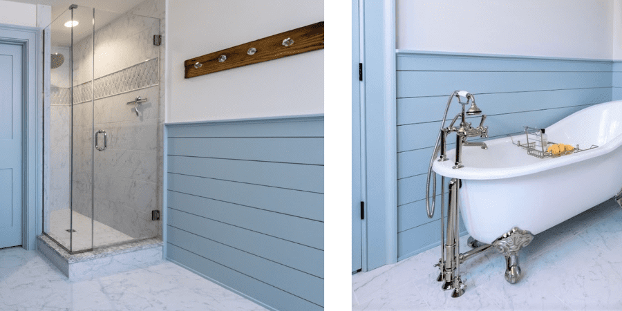
In the Century Farmhouse, the bathroom seamlessly blends old and new. Not only was the bathroom updated with modern amenities and finishes, like a walk-in shower and large marble tile, but the contrast highlights the shiplap and clawfoot tub in a tasteful and sophisticated way.
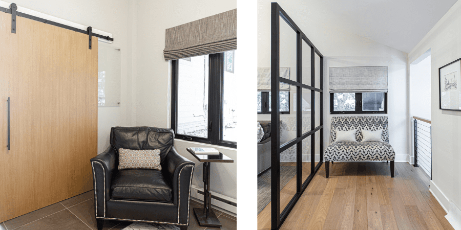
Barn doors aren’t typical of a mid-century ranch home; however, blending the function of a barn house door with the sleek, flat style of the mid-century era creates an unexpected twist on a classic. Instead of reading as “country chic” the feature reads as “modern industrial.”
Designing for natural light
Every homeowner yearns for more natural light in their home. It saves energy, is a fantastic mood-lifter, and offers the perfect lighting to highlight great design. However, not every space in a home is conducive to injecting natural light. In these tricky spaces, creativity is a must.
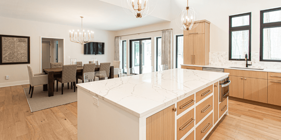
In the mid-century ranch home, the homeowners were concerned with the amount of light in the kitchen. The solution was to add clerestory windows to the upper part of the wall between the kitchen and dining area. This allowed for natural light to pour into the kitchen, where upper cabinets tend to take up wall space, disallowing additional windows.
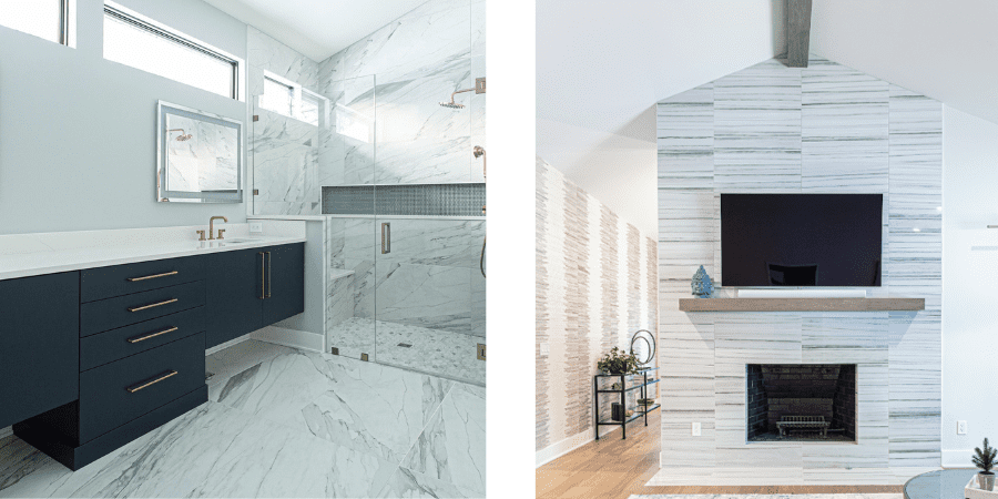
In the bathroom, a similar application of clerestory windows aids in allowing natural light into the space without sacrificing privacy. In both cases, the horizontal windows also fit the low-slung architectural character of a ranch home.
The Right Finishes in the Right Places
The wrong finish can distract from the intended style of any feature. A wood tone with a clashing paint color, tile that’s ill-proportioned to the space, and overly ornate hardware that distracts from a sleek cabinet will ruin the overall design of a room. A skilled designer will know how to create a cohesive look, where every detail communicates with the next.
In our 60s ranch home, ensuring the statement fireplace feature both stands out and fits in was key. The width of the fireplace is accentuated by the horizontal linear pattern on the facade, making it appear more grand, but is subtle enough to not overpower the living space. Additionally, the rift white oak mantle adds just enough contrast to stand out but not enough to take away from the fireplace.
Neutral but Not Boring
A neutral palette can be calming and refreshing, but it can also be underwhelming without the right finishes and colors to create some interest without being fussy. To pull this off, visual texture, careful attention to corresponding details, and a palette that offers variation without too much contrast can take a neutral palette from sanitized to refined.
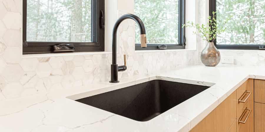
The homeowners of the mid-century ranch home wanted a kitchen that was neutral but not boring. The two-toned cabinets, using rift white oak stained in a light husk color and Sherwin Williams High Reflective White, offer just the right amount of variation. Also, the plumbing fixture, light fixture, black sink, black-framed windows, and gold hardware all subtly coordinate without being distracting. The trick here was to apply some variation with two metal tones, with the connecting factor being the black and gold faucet.
As for visual texture, the 3” hexagon mosaic Calacatta marble backsplash truly delivers. It communicates just the right amount of drama without taking away from the clean composition.

Contemporary Warmth
Unfortunately, the contemporary design aesthetic has a reputation for being cold and uninviting. Flat front cabinets, sleek lines, glossy finishes, and minimalistic features make up the contemporary design style. However, these characteristics can easily be infused with warmth and character if it’s executed mindfully.
The ranch home is an excellent blend of contemporary and modern features. The flat front cabinets, minimalistic hardware, careful application of industrial materials, absence of trim, and the use of straight and diagonal lines are softened by the materials, colors, and metal tones throughout the remodeled home.
Natural Wood Features
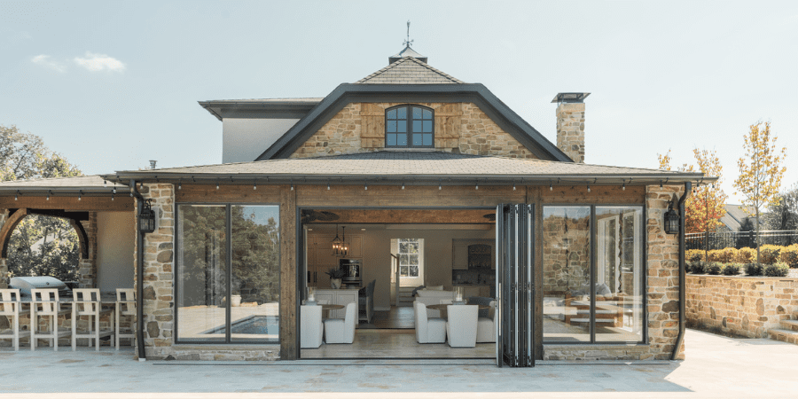
The tone, placement, grain, and style of natural wood can shift a design style from rustic cabin to a sleek contemporary. Through time, natural wood has been favored by homeowners to add warmth and depth to a space. Use too much and a home can feel like a lodge. Use too little and a home can feel cold. How wood is integrated into a home’s design must be measured carefully.
The Gallagher pool house in Chagrin Falls was thoughtfully designed to correspond with the existing home and the natural beauty that surrounds it. From the inside of the structure to the outside, every material was carefully chosen to balance one another. Natural stone, rough-sawn cedar, and white oak hardwood flooring were chosen to create this French Country design that still reads as quite current. The generous use of wood is paired with a palette of cream and blue throughout the kitchen, wet bar, and full bath which add to the overall balance of the space.
YOur Cleveland home deserves great, not good
The journey through the Century Farmhouse and the mid-century ranch home underscores the prowess of architectural innovation that defines the design expertise of Payne & Tompkins Design - Renovations. Through meticulous design, thoughtful material selection, and impeccable craftsmanship, these homes have been transformed into timeless masterpieces. Whether your home is only 20 years old or a notable piece of historic design, Payne & Tompkins has the skill, knowledge, and experience to update the layout, create seamless additions, and work with you to choose the perfect finishes. Contact Payne & Tompkins to schedule a consultation today.
